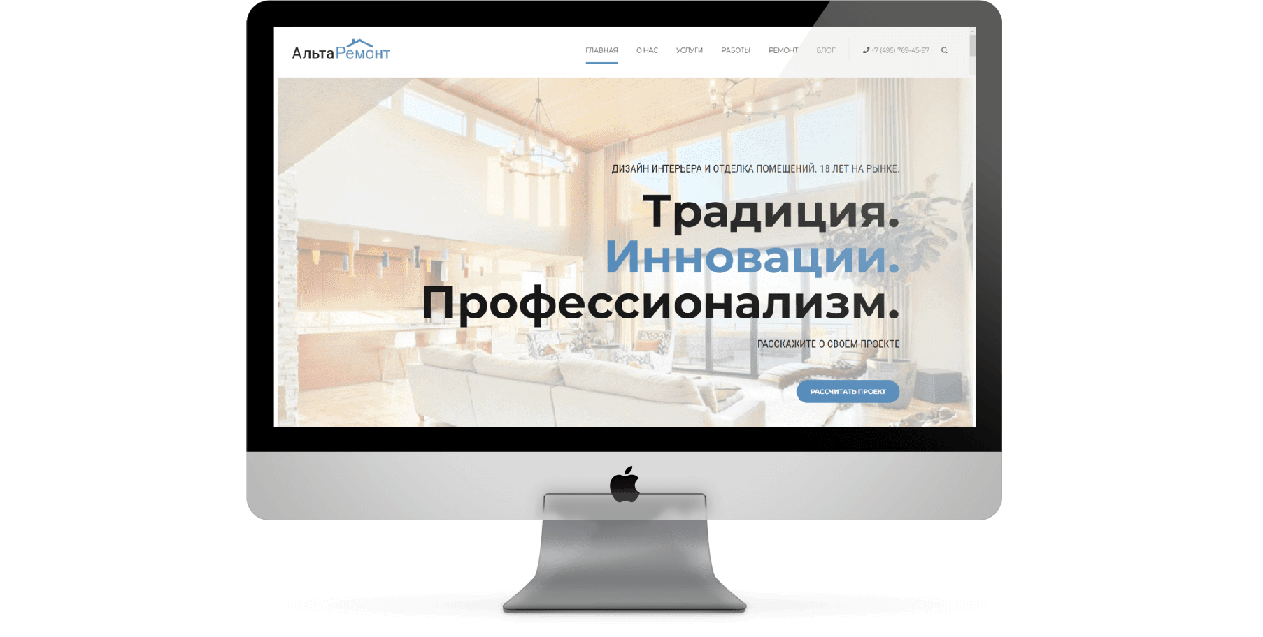
A Moscow company with a large portfolio of completed renovations, from cosmetic to designer projects. All of it existed, but none of it was shown: the old site offered neither a showcase of work nor a clear structure. We built a multi-page website around the portfolio, with a separate page for each type of renovation and a landing page for ad traffic.
2 months
5%
Alta Remont had dozens of completed renovations under its belt, from cosmetic to designer projects. But there was nowhere to show them: the old site offered neither a showcase of work nor a coherent structure. The portfolio, which is what trust in this niche rests on, existed only as scattered photos. The company had grown, but the site stayed the same, and the first thing a person looking for a renovation saw didn’t match what Alta Remont does on site.
In this niche, trust rests on work already done: people choose based on what they see, not on promises. So we put the portfolio at the center of the site, with a separate page for each project instead of a general gallery. Around it is a clear structure: three types of renovation are separated so people can find theirs right away. We also built a separate landing page for Yandex Direct traffic, the whole site condensed into one page. Plus a blog as a foundation for further growth.
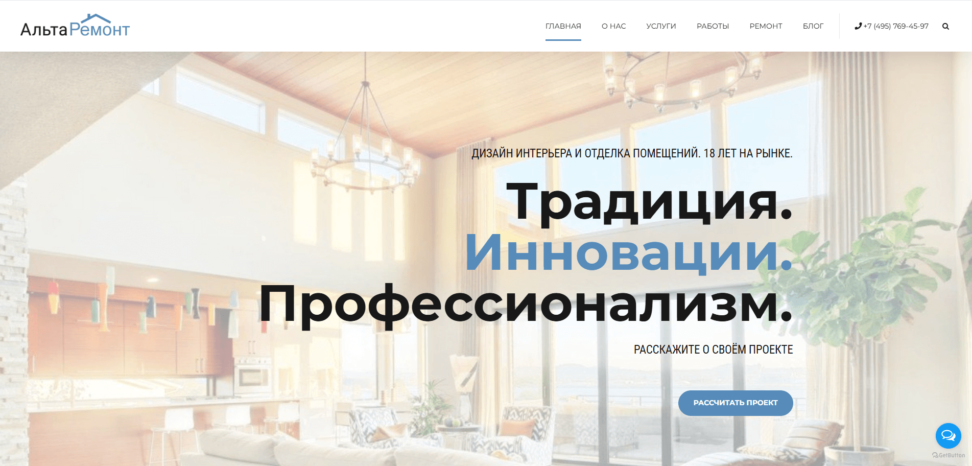
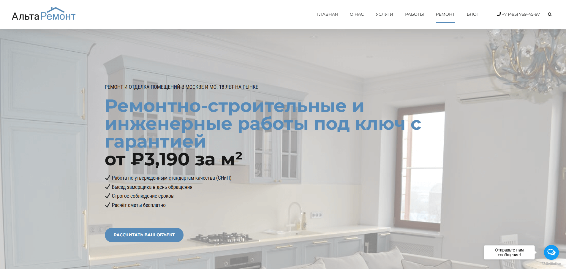
In apartment renovation, people buy what they’ll see in their own home, so we gave the top of the homepage to an image of a finished interior rather than words: a bright room, a clean magazine-style layout. At first glance, before reading anything, the client understands the quality of the work.
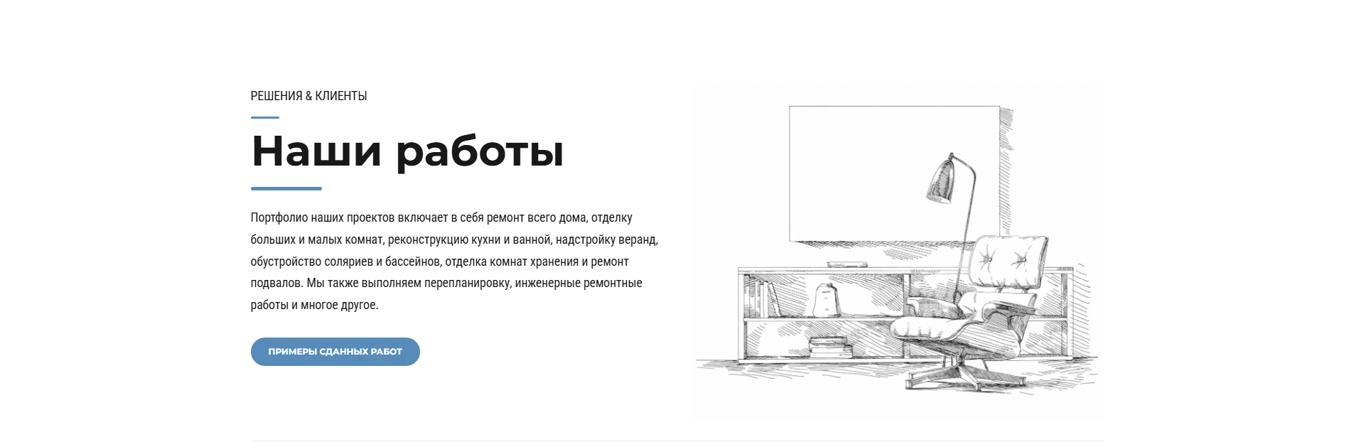
The portfolio is the most important part of the site, but throwing it at visitors as a wall of photos right away would wear them out from the start. So we made the transition to the work through a line illustration: it marks the section and leads inside to the finished projects instead of overwhelming people at the outset.
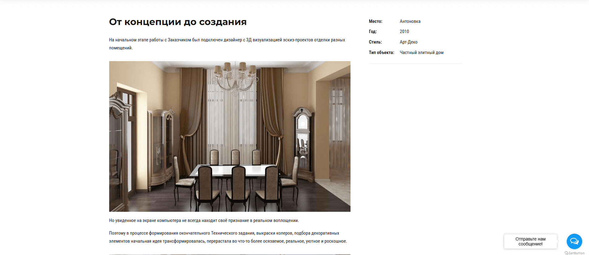
This is everything the site was built for. Each renovation has its own page: what it was before, what it is now, the scope of work. The full story of the project, not one tile in a shared grid. The client sees specific apartments instead of an abstract “we do renovations” and decides whether it looks like what they want at home.
For the Yandex Direct campaigns, we built a separate page that condenses the whole site: renovation types, price, portfolio and a form on one screen. A person who arrives from an ad gets an answer to their query right away, without having to navigate the structure of a large site.
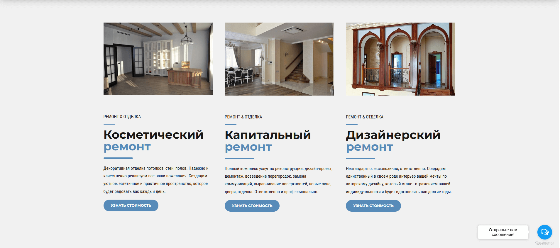
Not all renovations are equal: painting walls and a full layout change from scratch are different budgets and different conversations. So on the landing page, the work is split into three clear types (cosmetic, full and designer), each with its own button to see the cost. Clients immediately see that their case is understood in specific terms here, not priced as an “average renovation.”
The site was built to attract traffic, and it does that job: the landing page converts at 5%. But it turned out to do more: today the company uses the site as proof in negotiations, showing clients the portfolio of finished apartments, and most questions about whether they can handle the client’s renovation simply go away. The portfolio has become the main argument in the conversation. The project remains on our ongoing maintenance plan.
We start the same way we did here, by analyzing your business: what you do, for whom, and what your reputation rests on. Then come the structure, copy, design and a website built around it. We’ll show you the top section of your homepage for free, in three days.
Or message us right now
We use cookies to improve your experience on our website. You can accept cookies or customize your preferences.
Fill out the form, and we’ll get in touch to clarify a few things about your company and the task, by call or by message, whichever suits you. Then:
There’s no obligation whatsoever.
